Version of Liberation Mono font family with increased line-height.
I like Liberation Mono for its state-of-the-art bold and italic and excellent hinting. But I not like how it looks in Eclipse IDE, I mean line-height: lines appear so close to each other, so hard to read. So after spending a few hours searching for a good font family and disappointing in what's purposed, I opened original Liberation Mono in font editor and increased line-height to make it look nicer and much more readable in Eclipse.
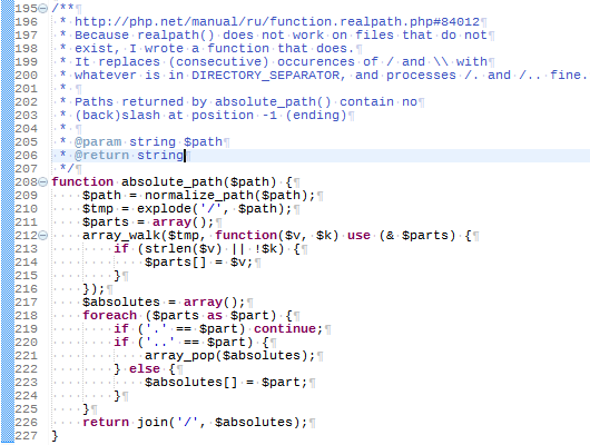
This is the Original Liberation Mono:

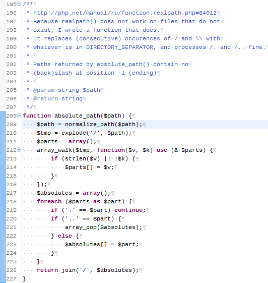
And that is Liberation Mono High with increased line-height:

https://github.com/aplab/Liberation-Mono-High